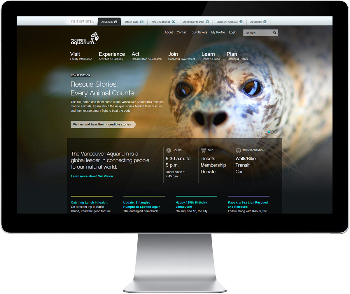
Visitors to the main Vancouver Aquarium website are first presented with a global navigation bar, allowing them to travel to a number of the Aquarium’s web properties. A carousel highlights current events and features; meanwhile, key information about the organization and venue, alongside some recent blog content, round out the page.
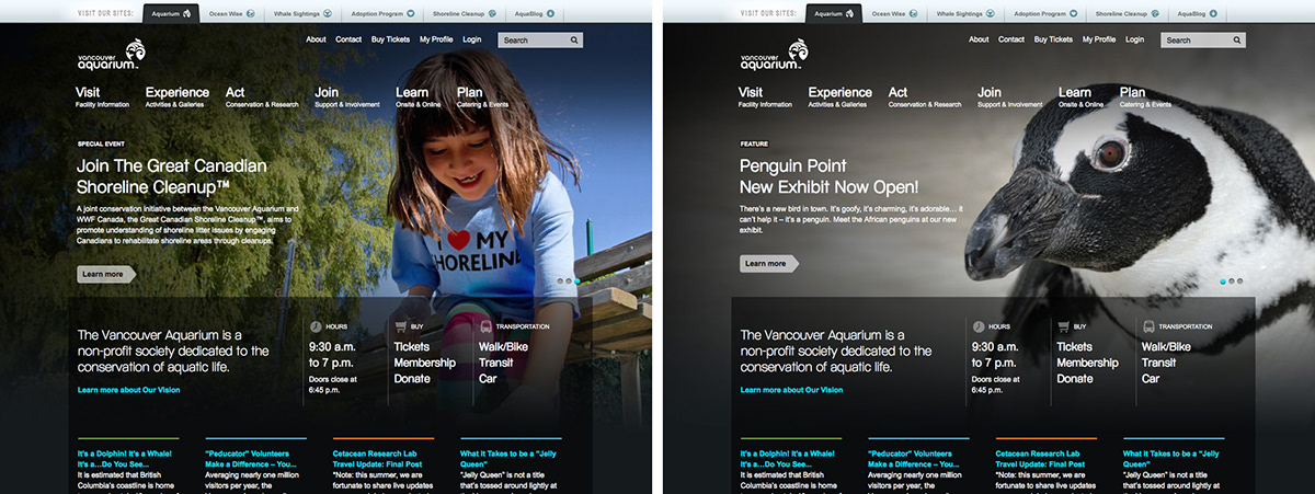
One of the most substantial changes to the Aquarium website, was the shift to thinking about the user first. This may be most evident on pages like the one pictured, in which the most relevant content takes the stage. Changes like this aren’t easy to make, however—such simplicity does require some deal of restraint.
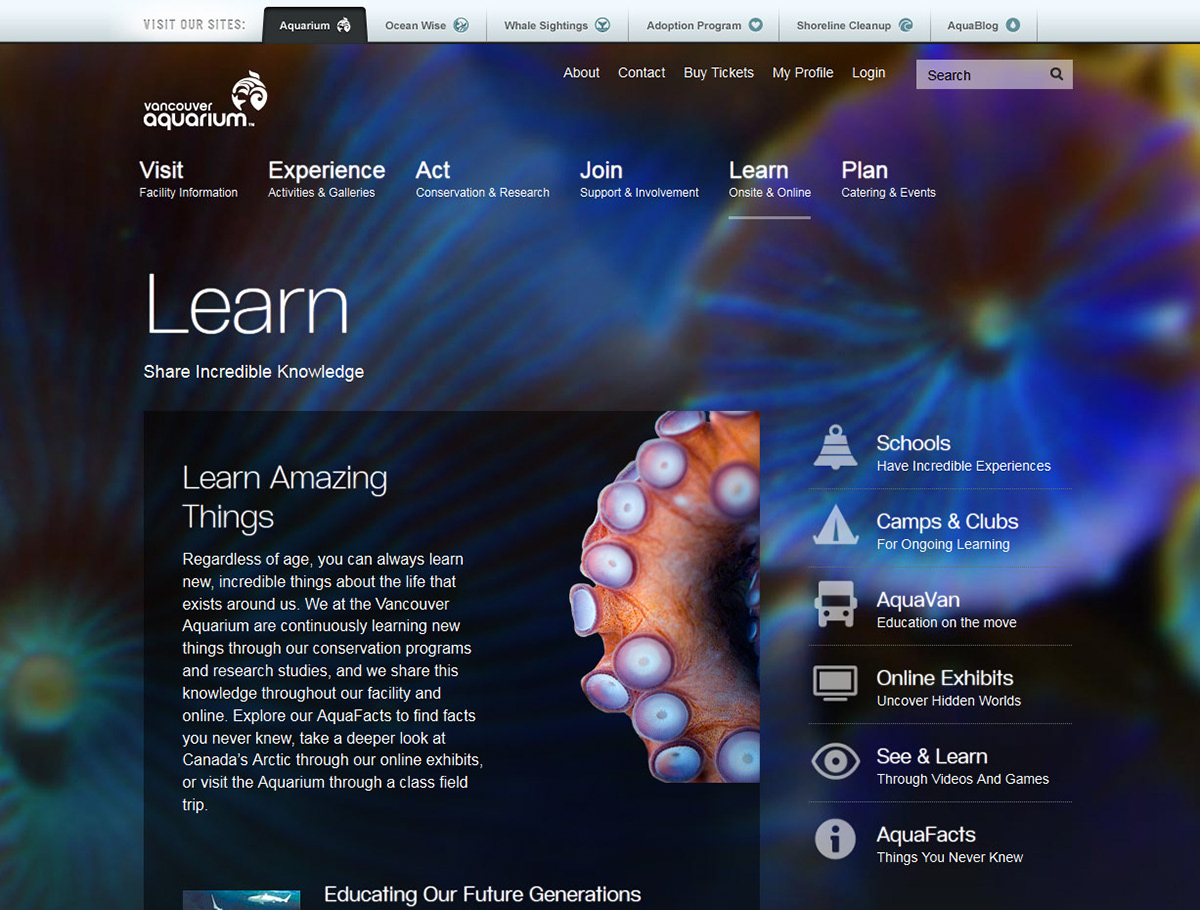
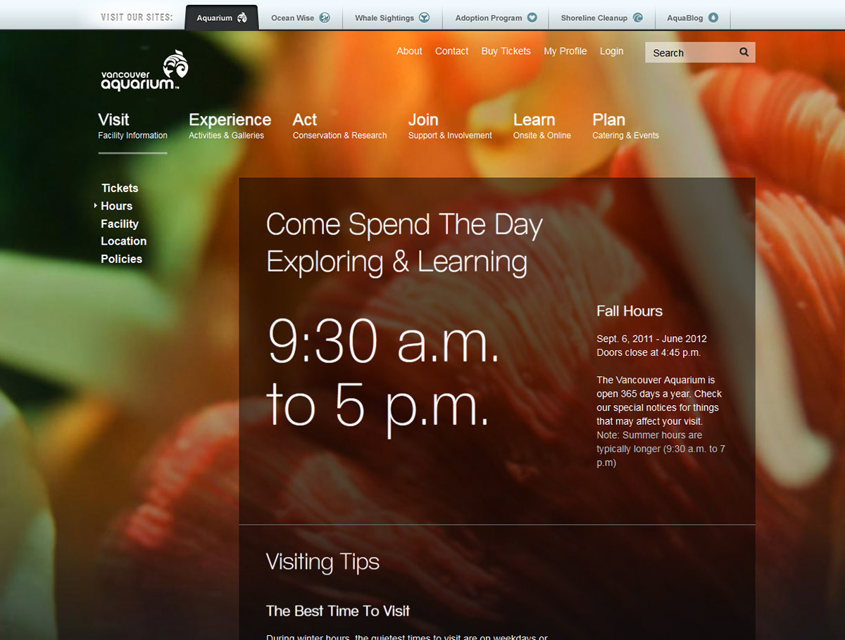
While many websites’ homepages aren’t matched in beauty as one moves through the site, vanaqua.org works to remain consistently involving and arresting. Main section pages, for example, feature close cut images, easy to scan text, and quick links—all in an effort to engage the visitor and encourage further exploration.
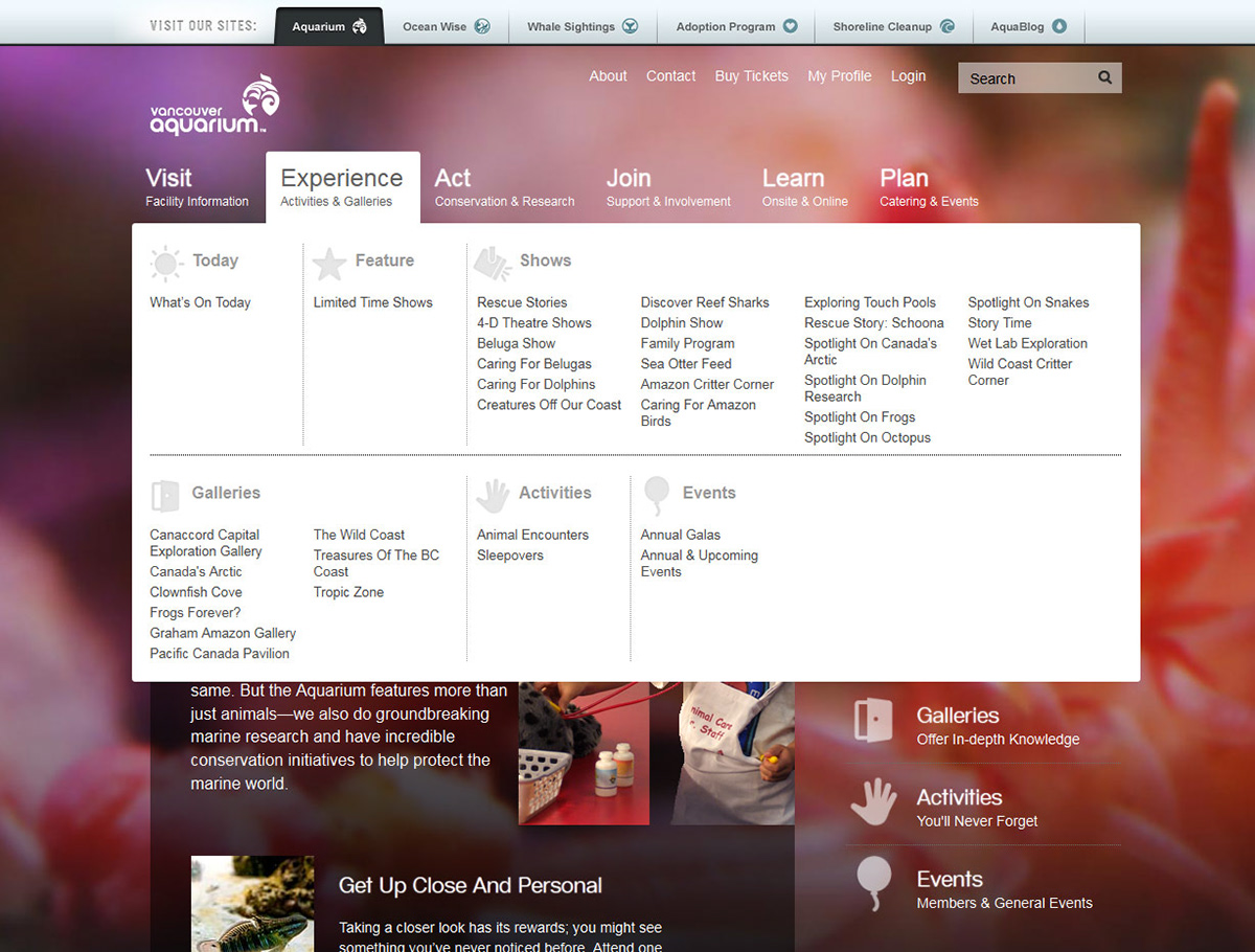
The “mega” drop down menu (industry language, not ours) is a really nice addition to the Vancouver Aquarium website. It allows users to drill down to any section of the website very quickly. Additionally, it’s highly adaptable to changing site content as well as the needs of the organization.
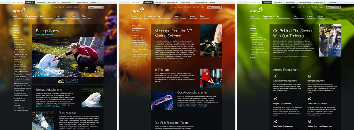
Visual variety is key to the Aquarium website. Lush, vibrant backgrounds immerse visitors in the kind of experience one has while at the venue. Depth comes in the rich content, images, and video that’s found throughout the entire website. At the same time, clear headings and groupings allow for easy scanning of page content.
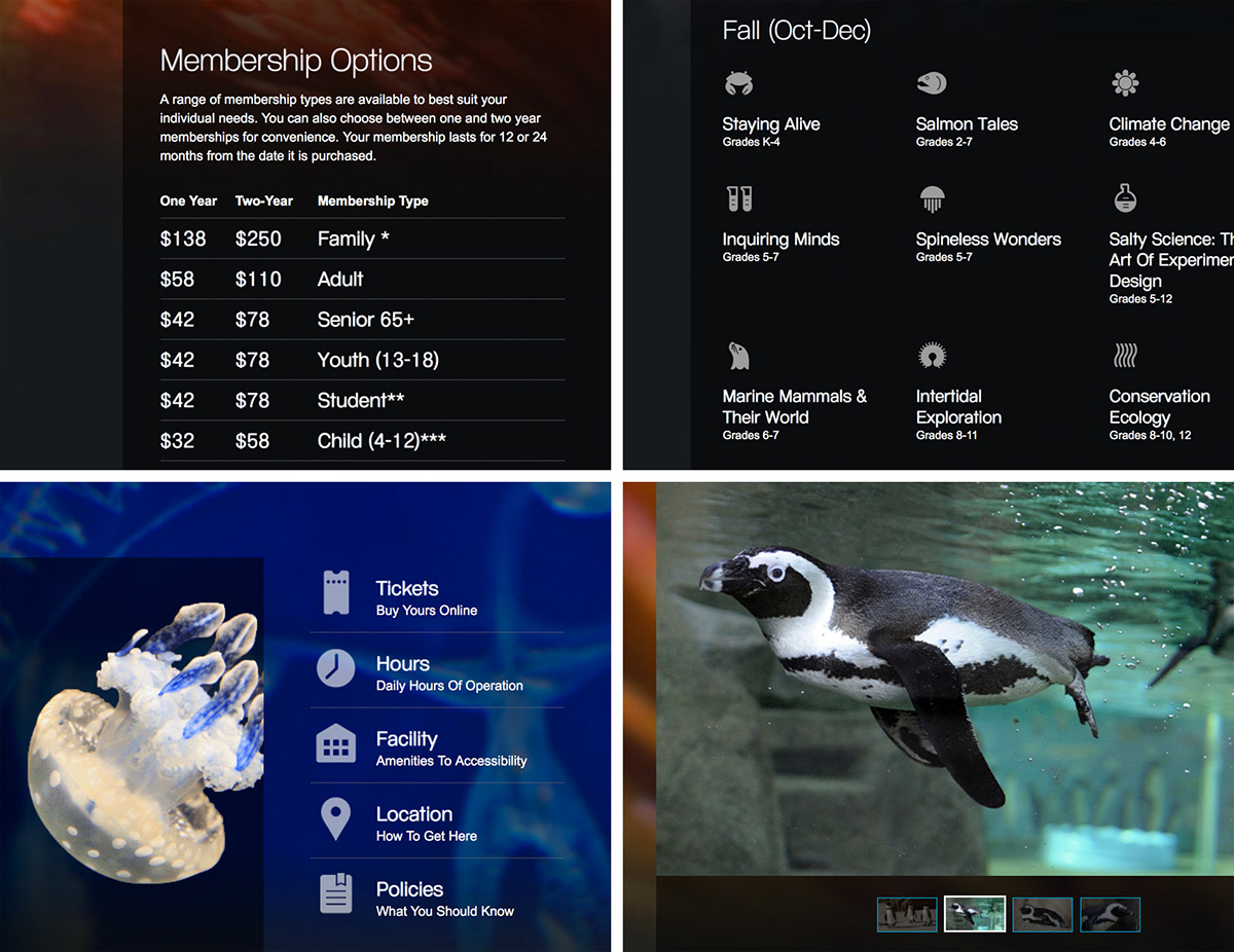
While most users likely won’t even notice them, details are a big part of this website. Pictured (from top left, clockwise): inline tables; wayfinding icons; quick-links; embedded image viewers. These seemingly small considerations make the user experience intuitive, responsive, and even fun.
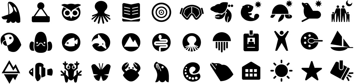
In addition to the many hundreds of images curated and edited for the website, nearly 300 custom icons were drawn. These simple and highly identifiable forms help users make sense of information visually, aiding in the overall site usability.
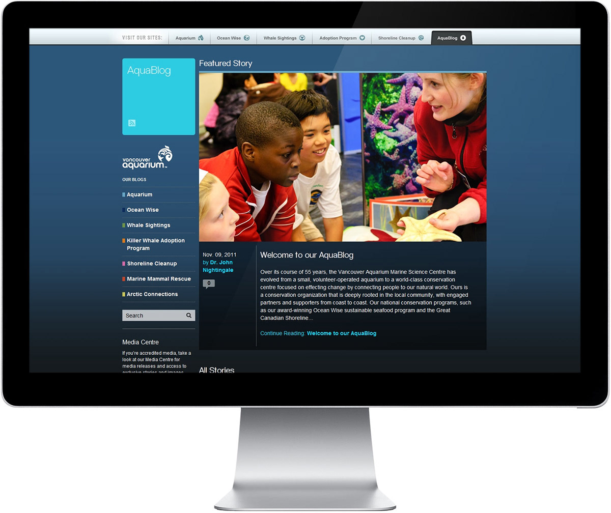
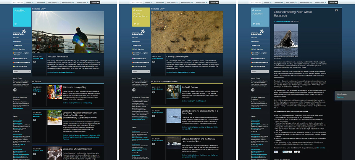
The AquaBlog works as a key tool in the organization’s outreach and engagement with the public. Organized into a few key categories, it allows readers to find content of specific interest, or to just casually browse. Multiple parties, from completely different departments, contribute to this online publication.
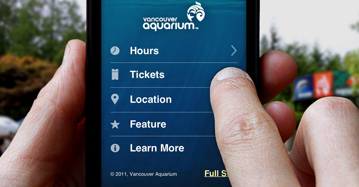
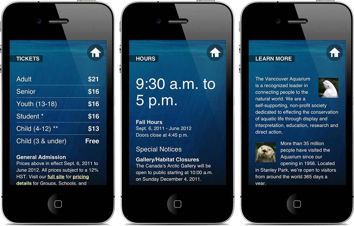
For those who are out-and-about, the Vancouver Aquarium offers a smartphone-friendly website that provides just the core facts, in a pared-down and mobile optimized fashion. Fast loading pages, highly simplified navigation, and big, easy to read text all make for a fine experience while on the road.
View the full case study here.


