Instagram.com
Surely by now we’ve all seen the latest addition to Instagram, the long awaited website. As a long time interface designer, I wanted to again test my skills and design the Instagram I wanted to see launch for myself.
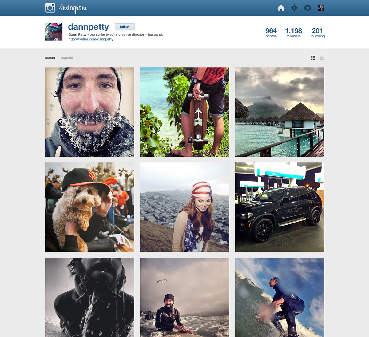
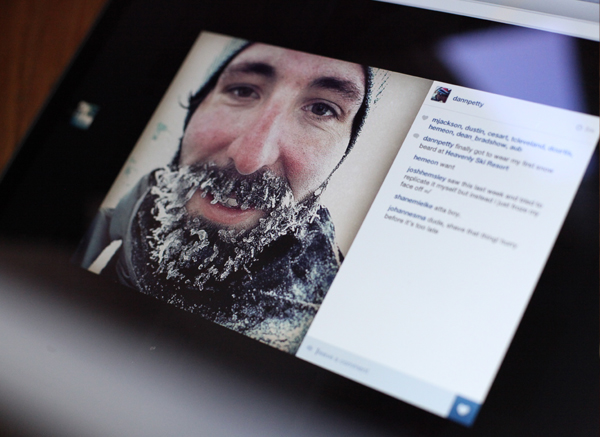
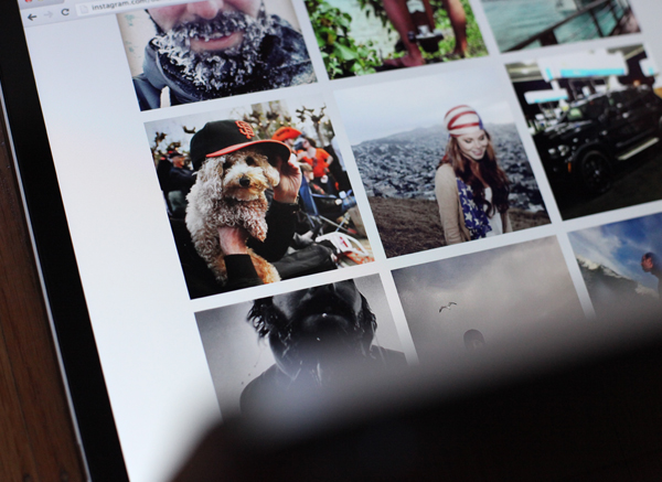
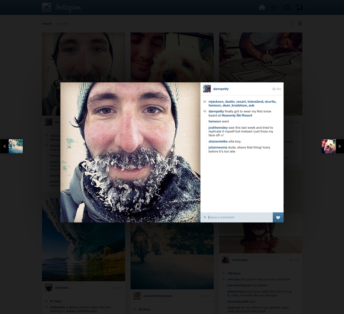
The Main Feed
I really wanted my Instagram feed to be easily scannable. With this new feed I created, I can clearly view at least 3 full posts to the 1 post that I was able to view on the current site. In my opinion, this brings back some of the fun the mobile version has with scannability. You’ll also notice I kept the comments and liking system pretty much the same as you would see on the phone. It is simple, small and out of the way, but there if you want them. I chose a flexible grid, much like Pinterest some would say, which helps keep the page interesting and less of a cookie cutter grid with everything always in line. Pages like this can get boring quickly, so throwing things off align helps.
I also added a few small features that might be nice, like filtering between recent and most popular posts today. There is even the ability to turn off comments and just scan photos. I’m a fan of non-repeating UI elements in grid layouts. What that means for this Instagram redesign is that I hid the “like” and “comment” buttons to only appear on the image during rollover. It keeps things much cleaner, yet still allows quick access to those features. You can also click the post to view a larger image in an overlay where those features are more prominent.
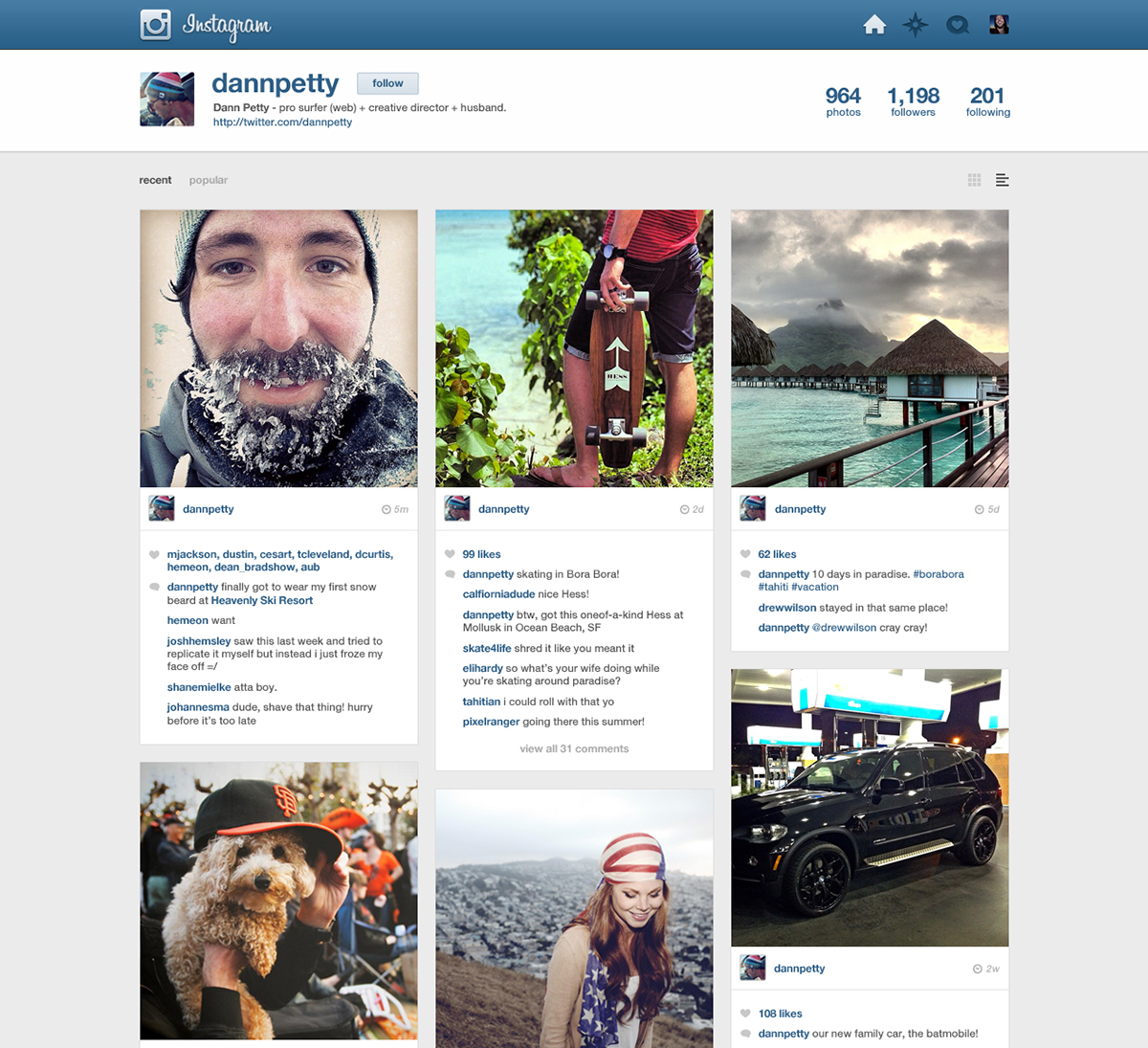
The Profile Page
I wanted my user profile page to look exactly like the feed. I mean, it should right? The only difference is that I added a “user info bar” on top that includes the username, bio, and stats, just like on the phone.