Rethinking the new Yahoo.com
In celebration of launching my latest project PSDs.co, a place for designers to download Photoshop files I’ve created, I wanted to test for myself how hard it would be for Yahoo! to do something drastically different — something unique, memorable, simple, but not Google simple. Not even a handful of hours later I was able to create these two designs of what I would have liked for Yahoo! to reveal.
The homepage.
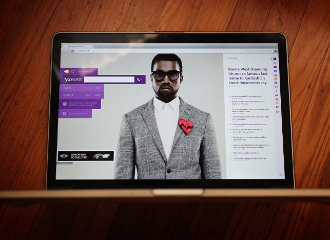
Yahoo! is a entertainment/news source site. Don’t think of it as a search engine. However, at the same time, don’t count them out, either. It’s still a staple in their business. With my version of the homepage, I wanted it to be fun and personal. This comp below is showing what a logged in user might see when they land on yahoo.com. Here’s a larger view.
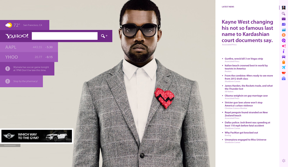
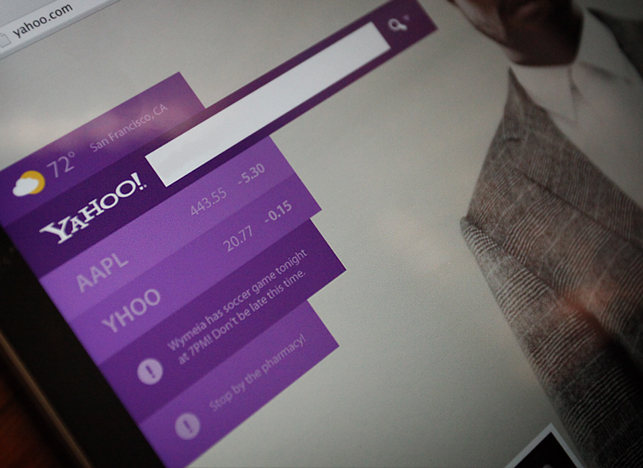
It features a full browser width design. On the left, you have a few personal items that you like to have upfront and center, to things such as your local weather, your favorite stocks, and even a few reminders that you left for yourself or that automatically show up through your Yahoo! email account. Of course, I needed to throw an ad in. Yahoo! has to make money you know, and I didn’t want to cheat on the design either, hehe.
On the right, are new Yahoo! navigation tools which when clicked, change what appears to the left of them. When you first land on yahoo.com, it’ll show on the right the top latest news. The big background image of Kayne is the featured news article. This featured area could be a big $$$ gainer for Yahoo! Imagine if MINI Cooper came out with a new car. They could pay Yahoo! the same cost as a Super Bowl ad to display it there. MILLIONS!! (ideally for logged out users landing on yahoo.com.)

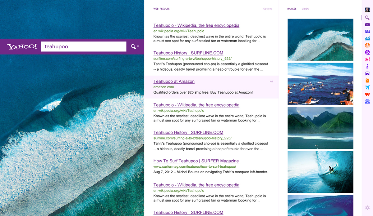
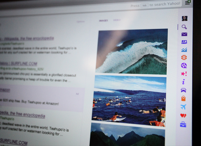
Search.
Ok, now just to show how nicely the rest of Yahoo! fits into this design, I quickly mocked up a version of how search might look. Here’s a larger view of the search.
Just as you’d expect, more big beautiful imagery! To the middle you’ve got the search results in a white column and a column of images and video beside it to the right. Anyone else hate to click “images” to see images? Yup, I didn’t think I was the only one. The first image could be the featured image that shows up on the left.
Check out the full article about my redesign on Medium.


