The previous version of the iStockphoto site suffered from trying to be everything to everyone.
From a customer perspective, it was confusing trying to understand what iStock's product offering was and how the business model worked. As a result, bounce rate was very high (especially among less savy users).
From a customer perspective, it was confusing trying to understand what iStock's product offering was and how the business model worked. As a result, bounce rate was very high (especially among less savy users).
The visual design was also quite dated and lacked the ability to properly showcase the breadth and
quality of content.
quality of content.

We started the project with user research from which we defined a set of primary personas. This allowed us to focus and prioritize our redesign efforts toward the customer types who needed it most.
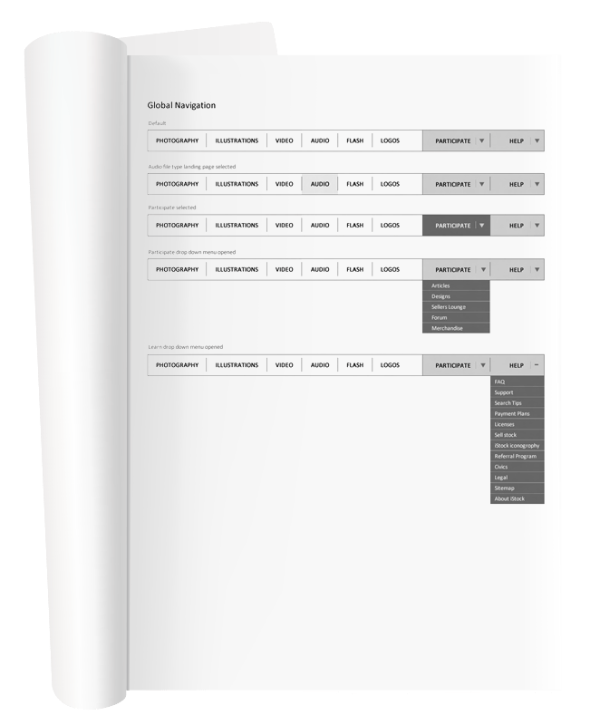
Then, we began looking at the overall archictecture of the site and reorganizing the structure to be much more customer facing and browse friendly. Primary content types were pulled into a main navigation bar and the contributor, educational and help content was re-organized into "Participate" and "Help" sections.
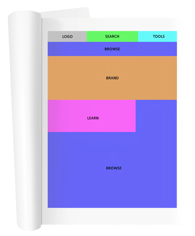
We then looked at the overal weighting of the home page.
Previously, search and browse functionality featured very little on the homepage – with the rest of the page being littered with educational content, help and contributor news. We sought to fix that.
The new customer centric home page was weighted very heavily toward both browse and search, while keeping ample room to promote brand and content.
This enabled us to present an experience that met the needs of all our customers. Savy users, could enter directly into a powerful facetted search experience, while less savy users could use many of our browse features to find their way to the right image.
Comprehensive UX documents were then created, outlining each page of the redesign with a strong focus on the functionality and behaviours of the home page(s), file type landing pages and facetted search.
Our UX Manager (Mikael Lindh) and I then compiled these, along with initial stage designs, and ran them through extensive usability tests in Calgary, Canada and Berlin, Germany.

Based on our findings through the Global usability tests, UX and design were run through another round of revisions and secondary usability before entering the full design phase.
This redesign went live in August of 2010. The results have been very positive for iStockphoto and, with continued testing and optimization, it's performing well to this day.
The pages you see below represent the full design of iStockphoto's 'Project F5'.
Not all of these features went live.
Not all of these features went live.

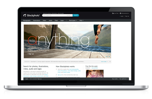
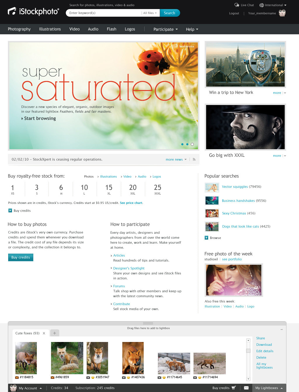
The Logged Out Home Page focuses much more heavily on elevating the brand through inspirational imagery. Additionally, it serves as the primary point of education for new customers. Explaining in simple detail what iStock is all about and how the credit system works.

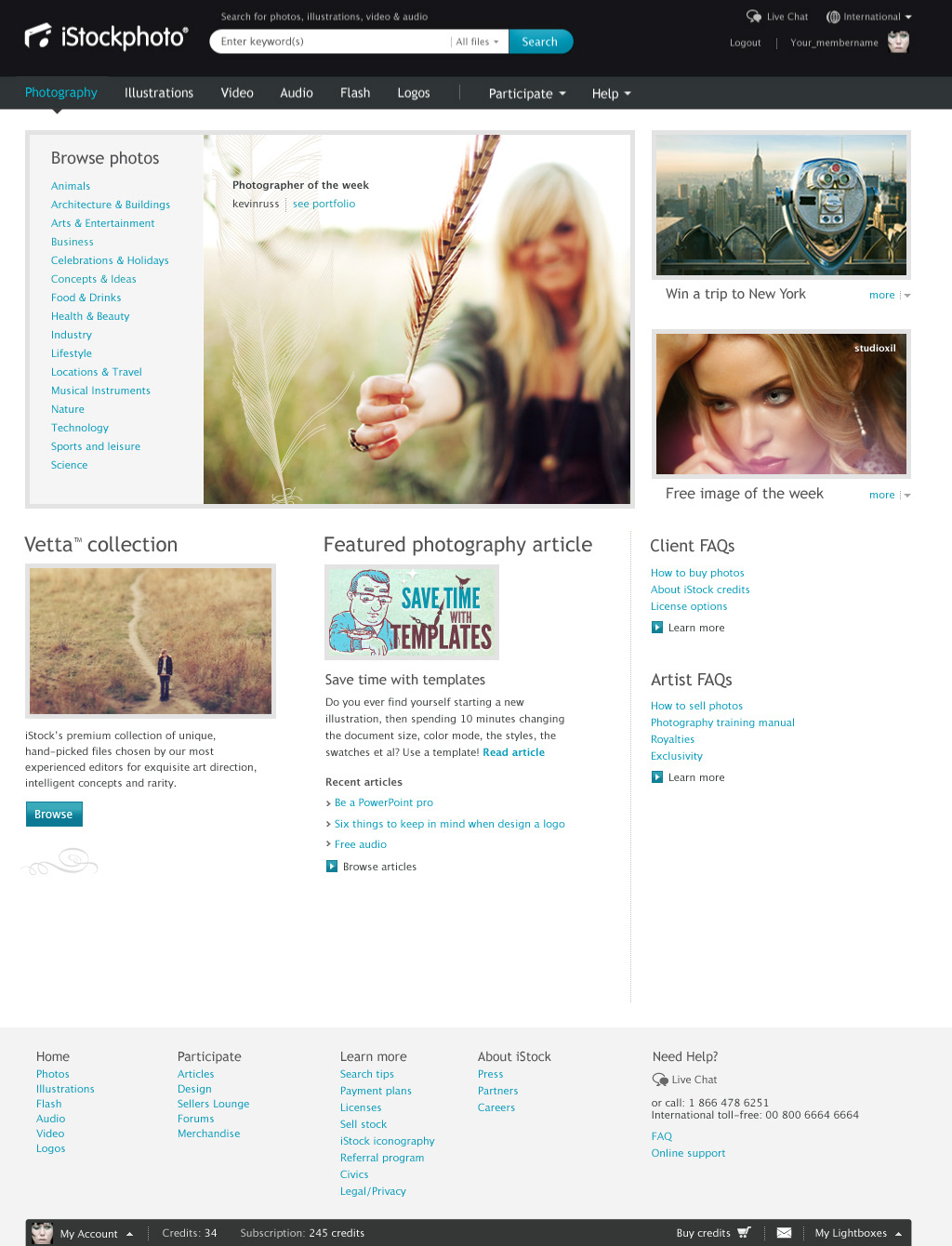
The Logged In Home Page pushes education down further on the page, while putting a much stronger emphasis on brand, search and browse. The idea being that a click anywhere on the first 2/3 of the page would result in either a search or browse action, allowing the user into the purchase path right away.
The toolbar at the bottom of all pages was designed to serve double duty.
Primarily, it's function is to act as the home for all account information. This includes credit or subscription balance, access to account preferences, site mail, payout totals for contributors and cart functionality.
Additionally, the toolbar was designed to act as a portable lightbox drawer that follows you throughout the site. Users can add, edit, share and delete lightboxes on the fly, while drag and drop functionality would allow them to very quickly populate the lightboxes right from the search results.
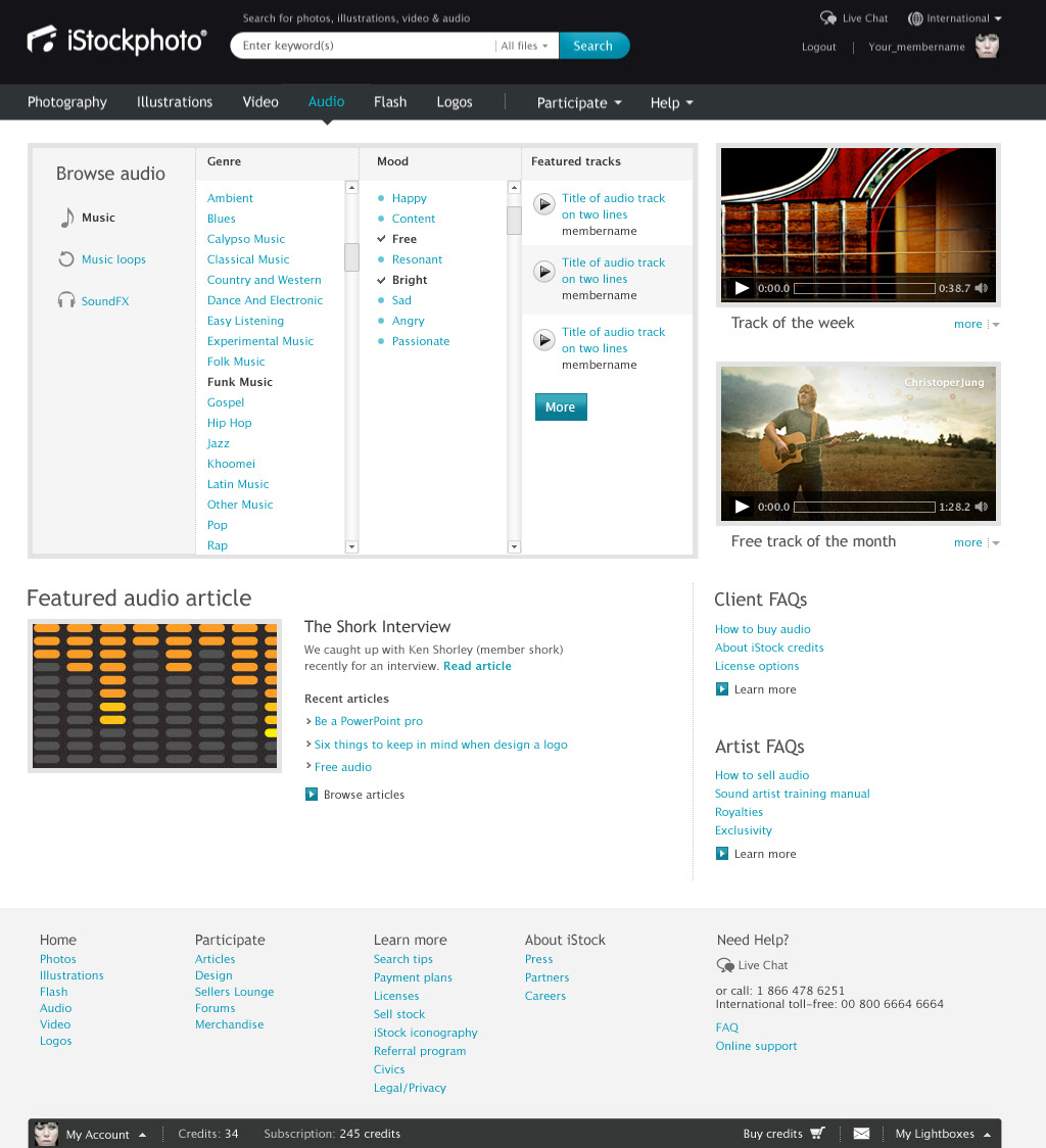
Customers who navigate directly to the File Type Landing pages are more likely to following a "Browse" behaviour. As such, these pages are designed to offer quick and easy Wizard like ways of accessing content.
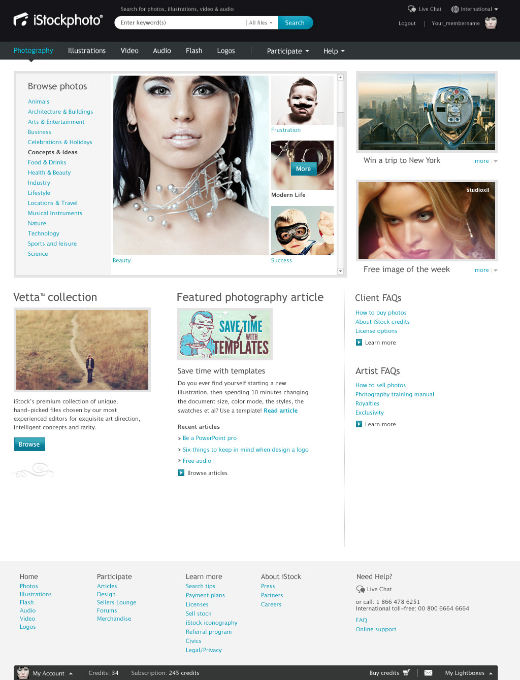
When a top level category is clicked on in the primary hero image, the navigation expands to show sub-categories in a visual format to aid in clarity.

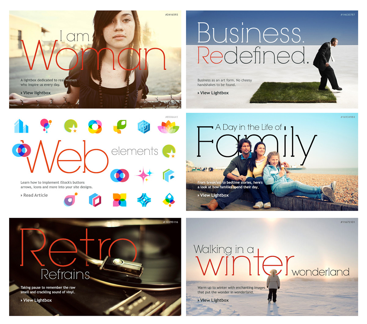
Featured Marketing Areas (FMAs) serve as the hero images on the Logged In and Out Home Pages.
These rotate on a bi-weekly basis, adding freshness to the site and showcasing high quality content in inspirational ways.
These rotate on a bi-weekly basis, adding freshness to the site and showcasing high quality content in inspirational ways.

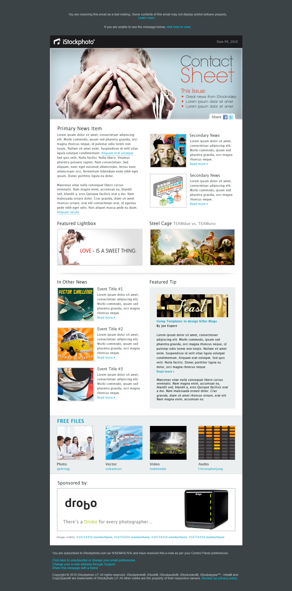
As part of the overall brand refresh, "The Contact Sheet" was also redesigned to meet the new visual language. Reaching over a million subscribers, these newsletters saw well above industry average open rates and a high rate of conversion.


