THE PITCH
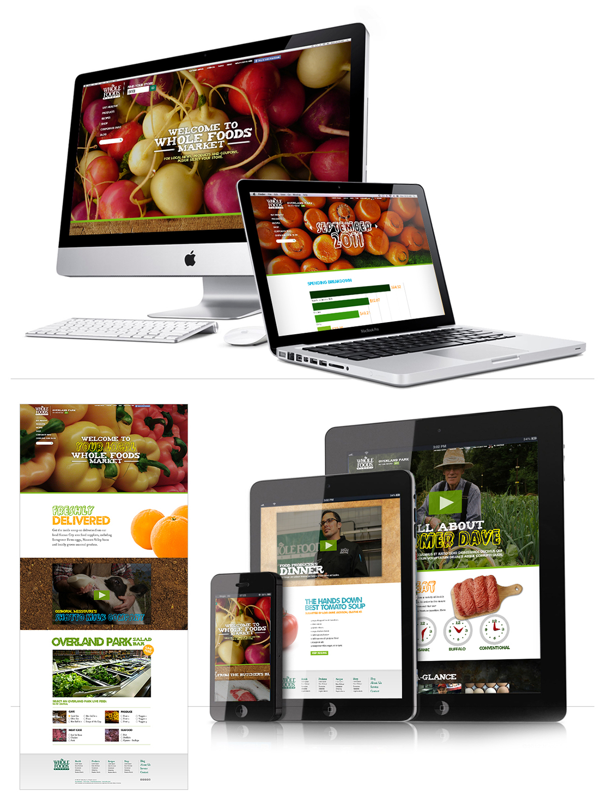
In-Store Experience
An all out creative pitch. Ask was to be fun and energetic without being realistic. We were to have fun and surprise them. All while thinking of how we could bring the mentality of a personalized community, like your local Whole Foods Market, online. A pure utopia of sorts. Oh yeah, all in 4 days.
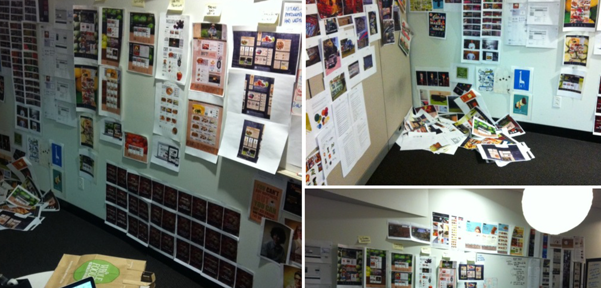
Our War Room
The Dagger Video sent after we pitched, thanking them for their time and the opportunity to potentially work with them.
THE REDeSIGN CONCEPTS
Option A - Gritty Premium
Inspired by the weekly coupons printed on newspaper that most WF customers were familiar with. By infusing that tactile, gritty quality with premium, mouth-watering cut-out imagery, this concept acknowledged the premium price guests often pay while still feeling obtainable and every-day.
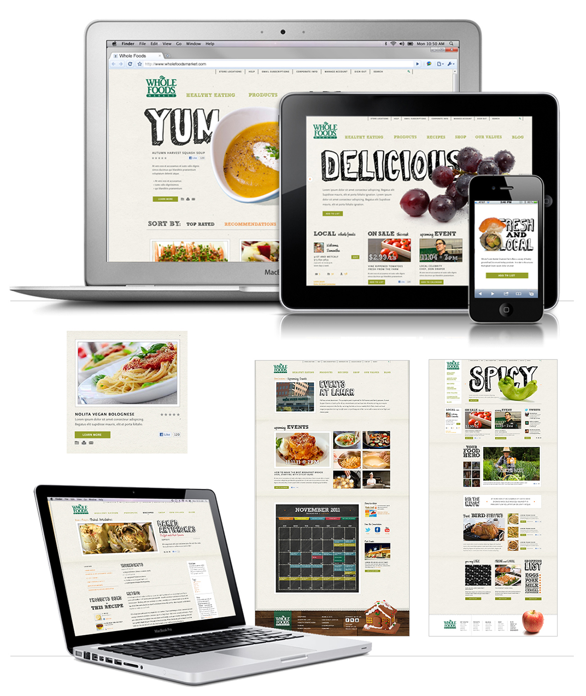
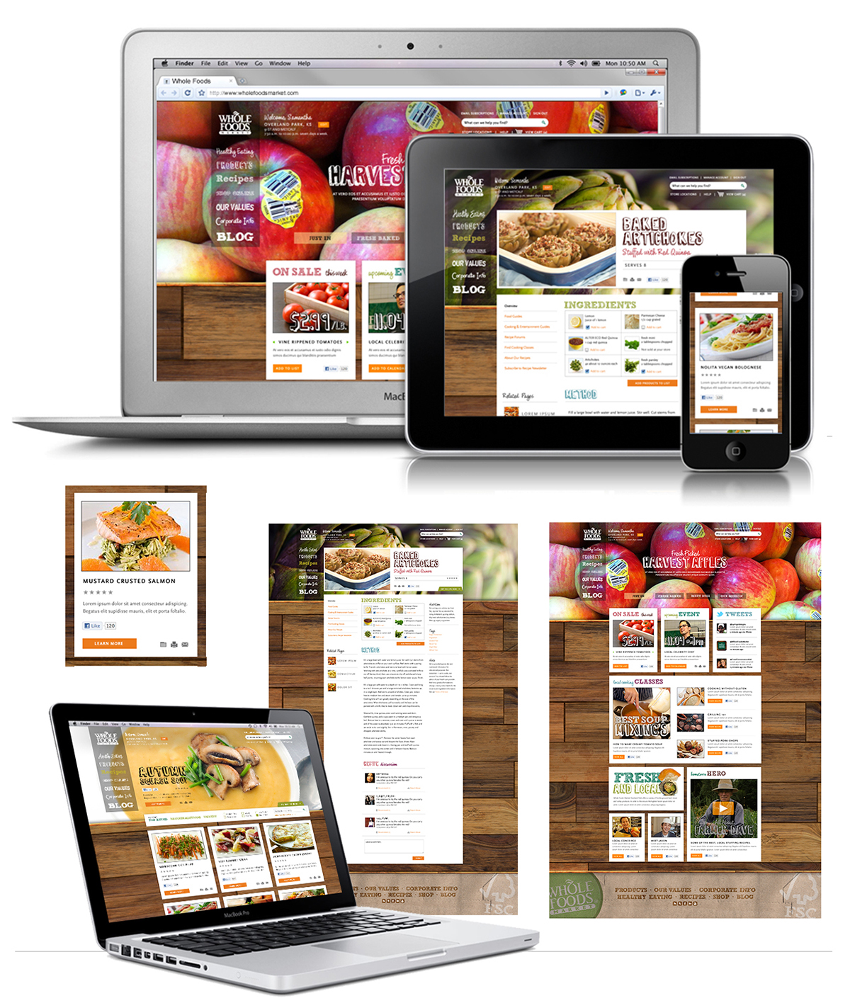
THE REDeSIGN CONCEPTS
Option B - In-StoreThis was the chosen direction to move forward with. We created 6 custom typefaces for Whole Foods and all were live-type when the site was launched. A 1st for any consumer facing website.
This design was inspired from that first impression of Whole Foods. Food porn everywhere, with amazing textures throughout the store. This concept brings the in-store look, feel and vibe directly to users miles away on the desktop computer and mobile devices.
This design was inspired from that first impression of Whole Foods. Food porn everywhere, with amazing textures throughout the store. This concept brings the in-store look, feel and vibe directly to users miles away on the desktop computer and mobile devices.